Case study – Flicker

The product:
Flicker is local candlemakers mobile application. Flicker objective is to deliver ethical, local and high quality goods straight to your door. They offer a wide variety of scents based based off every mood. Flicker creates products as if they are creating them for their own family.

Project duration:
August 2021 to March 2022
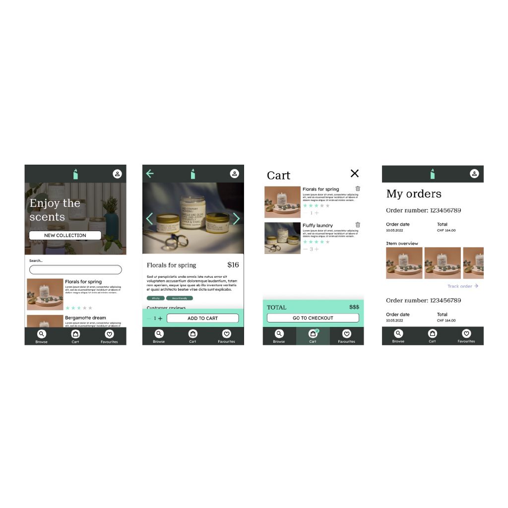
Refining the Design

The problem:
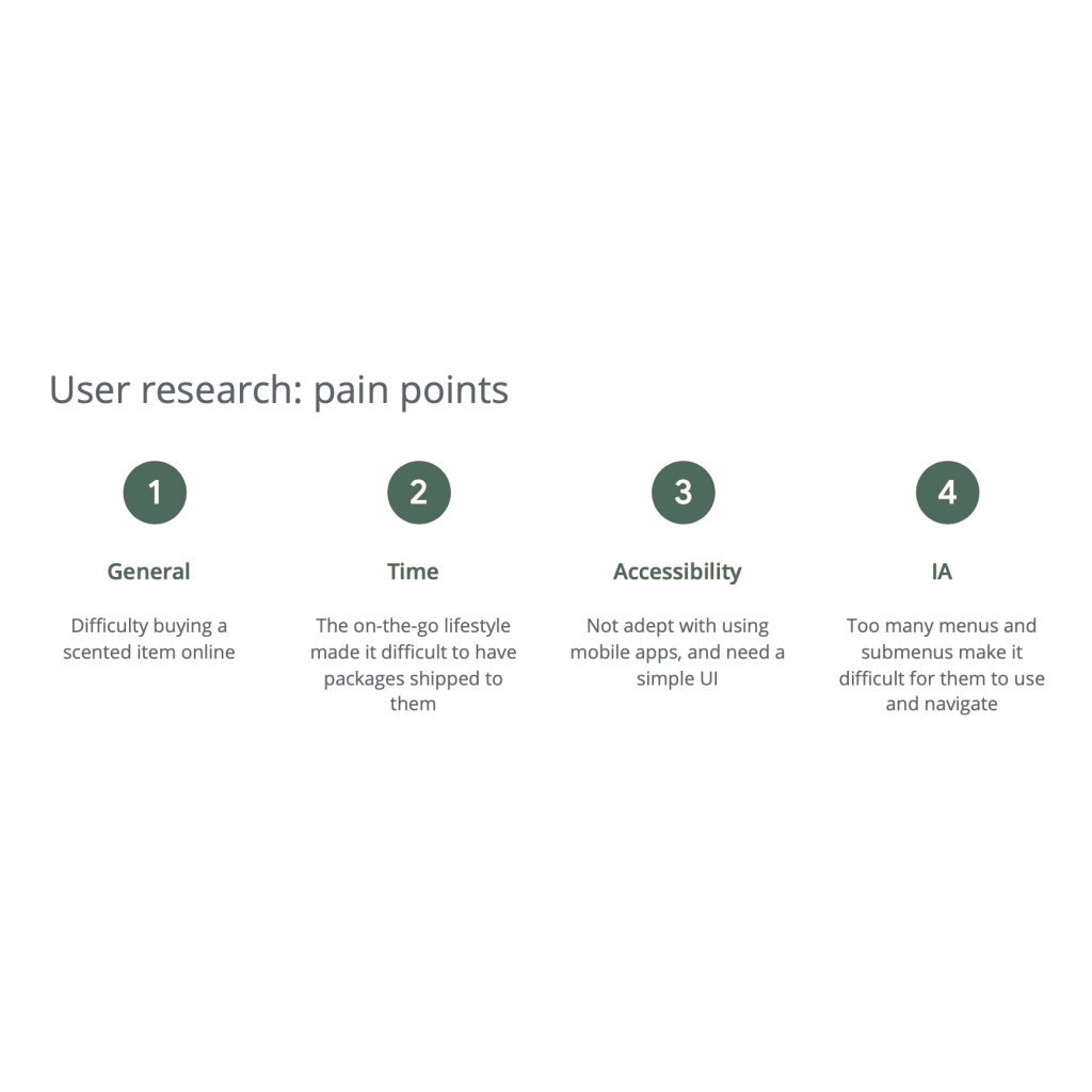
Difficulty buying a scent based product online quickly and efficiently.

The goal:
Convenient and accessible shopping application for ethical candles by your local candlemaker.

My role:
UX lead and researcher for designing a mobile app for Flicker

Responsibilities:
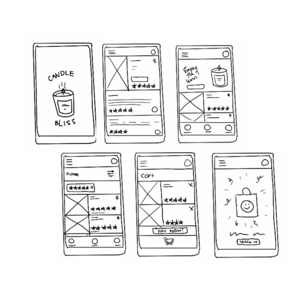
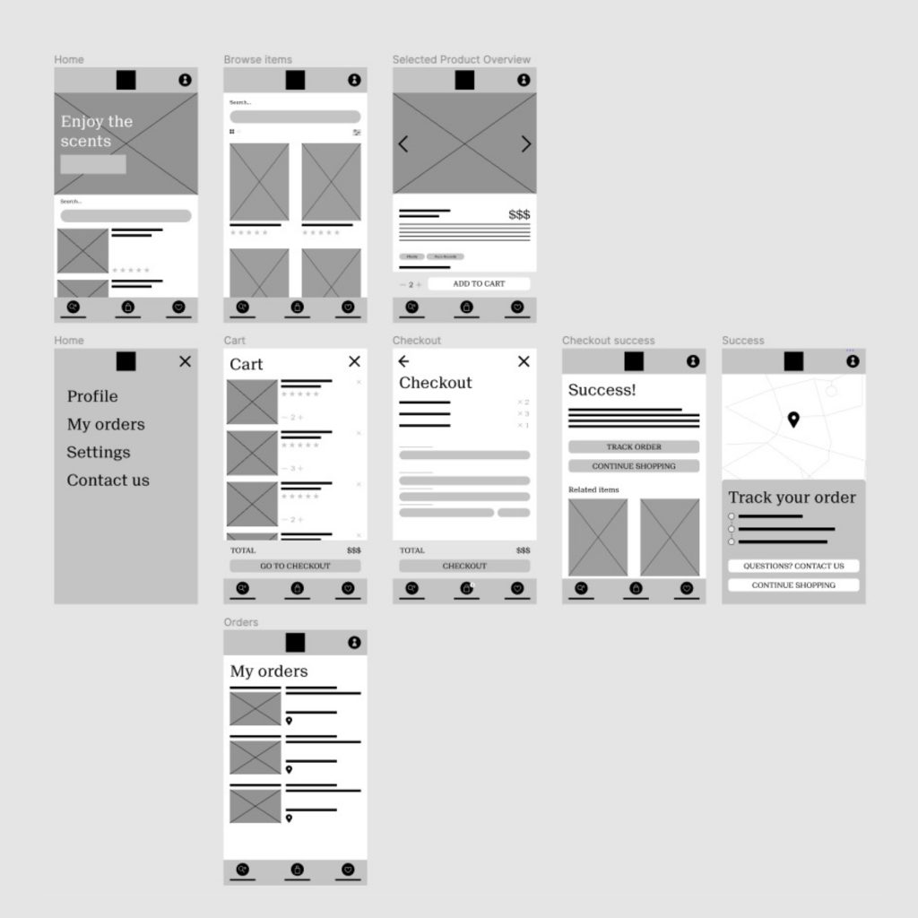
Creating project goals, conducting user interviews, paper and digital wireframing, creating wireframes to final prototype, accounting for accessibility, and iterating on designs

Understanding the user

Starting the Design

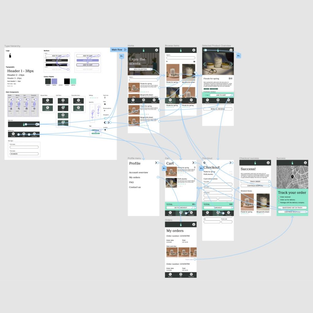
The main user flow: For the user to open application, browse for a product, select and checkout successfully for such product.

Start screen: Splash page while opening the app, and then user will see brief description of the company and products.

Actions: Opening app, scroll and/or filter for products, add item to cart, fill in information to checkout, checkout

Decisions:
-Do I want to browse product for more detail?
-Do I want to add item to cart?
-Do I want to checkout with X items?
-Do I want to add review?

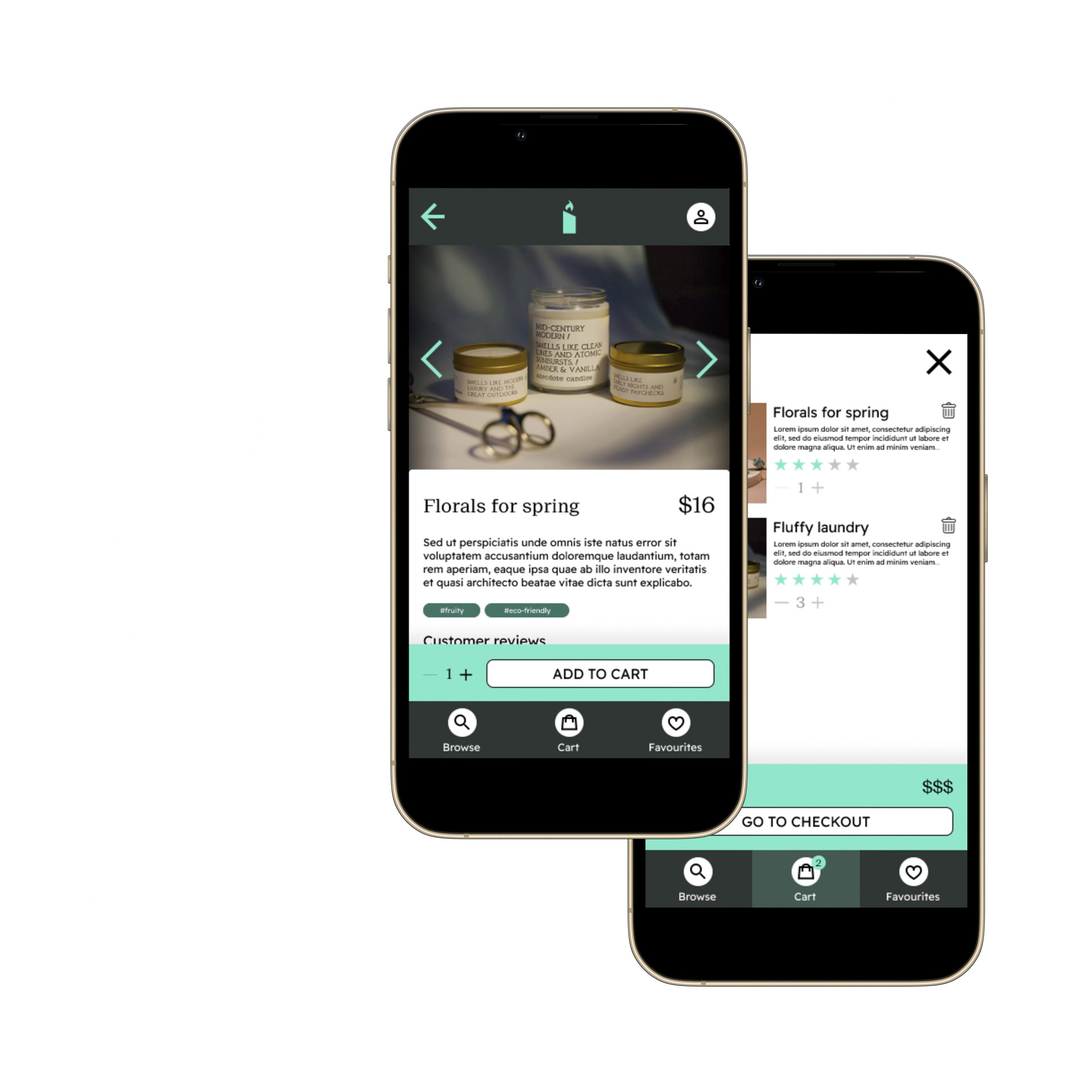
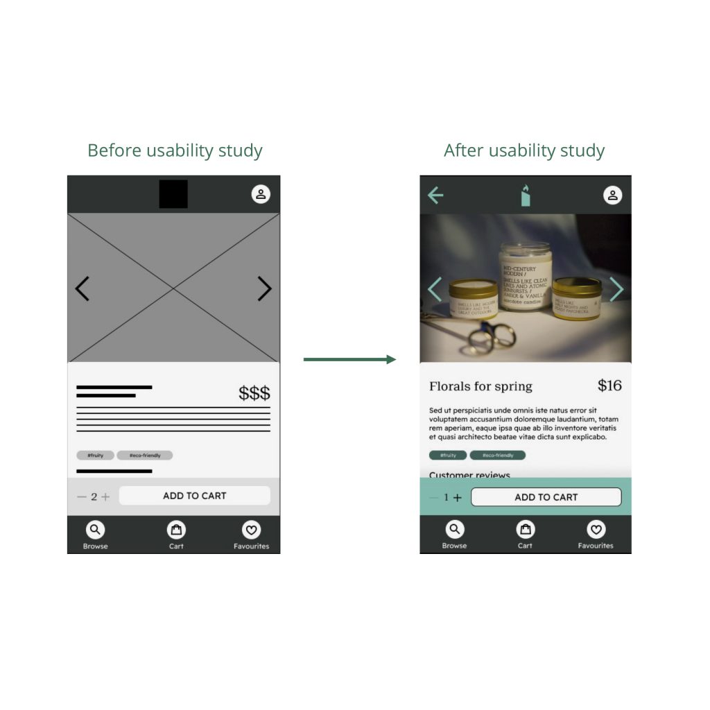
To make the page more accessible with the flow (back arrow), and improve CTAs.

Going forward

Impact:
The app feels fresh, modern and easy to use for the users. With a ‘scent’ based filtering and ratings, Flicker designs with their user in mind.

One quote from peer feedback:
“I really like the fact that at each screen I can easily understand what I’m seeing, and am able to always navigate back and forth throughout the app.”

What I learned:
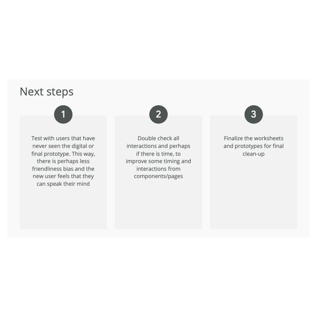
While designing the Flicker app, I learned that the user knows best and sometimes will tell you what exactly they want/expect to see. I also learned that with proper user testing, a lot of the design may change, but in the end it betters the users experience, the overall look and feel and the accessibility.

Thank you very much for taking the time to reviewing my work on the Flicker app for our local candlemaker.