Case study – food with thought

The product:

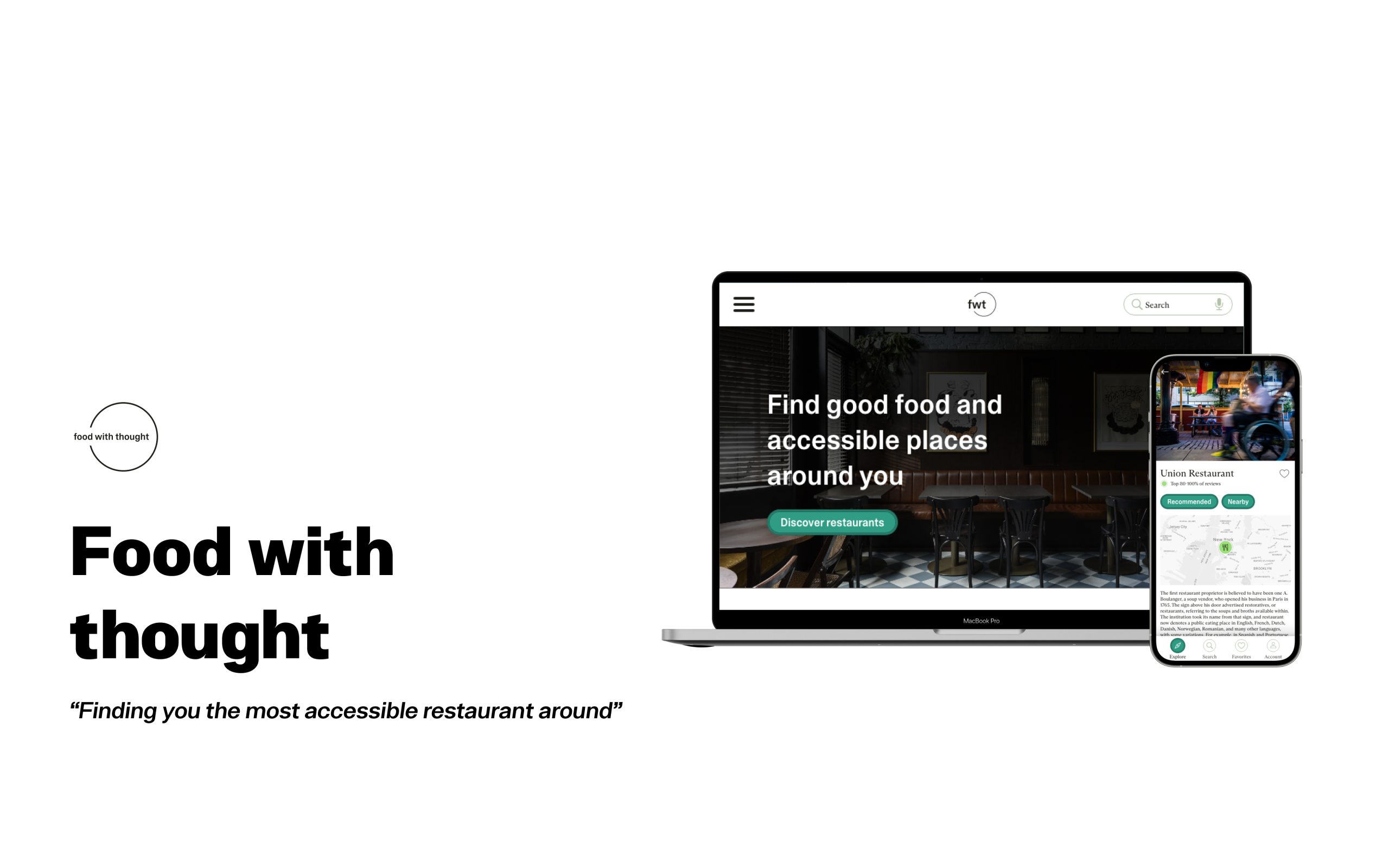
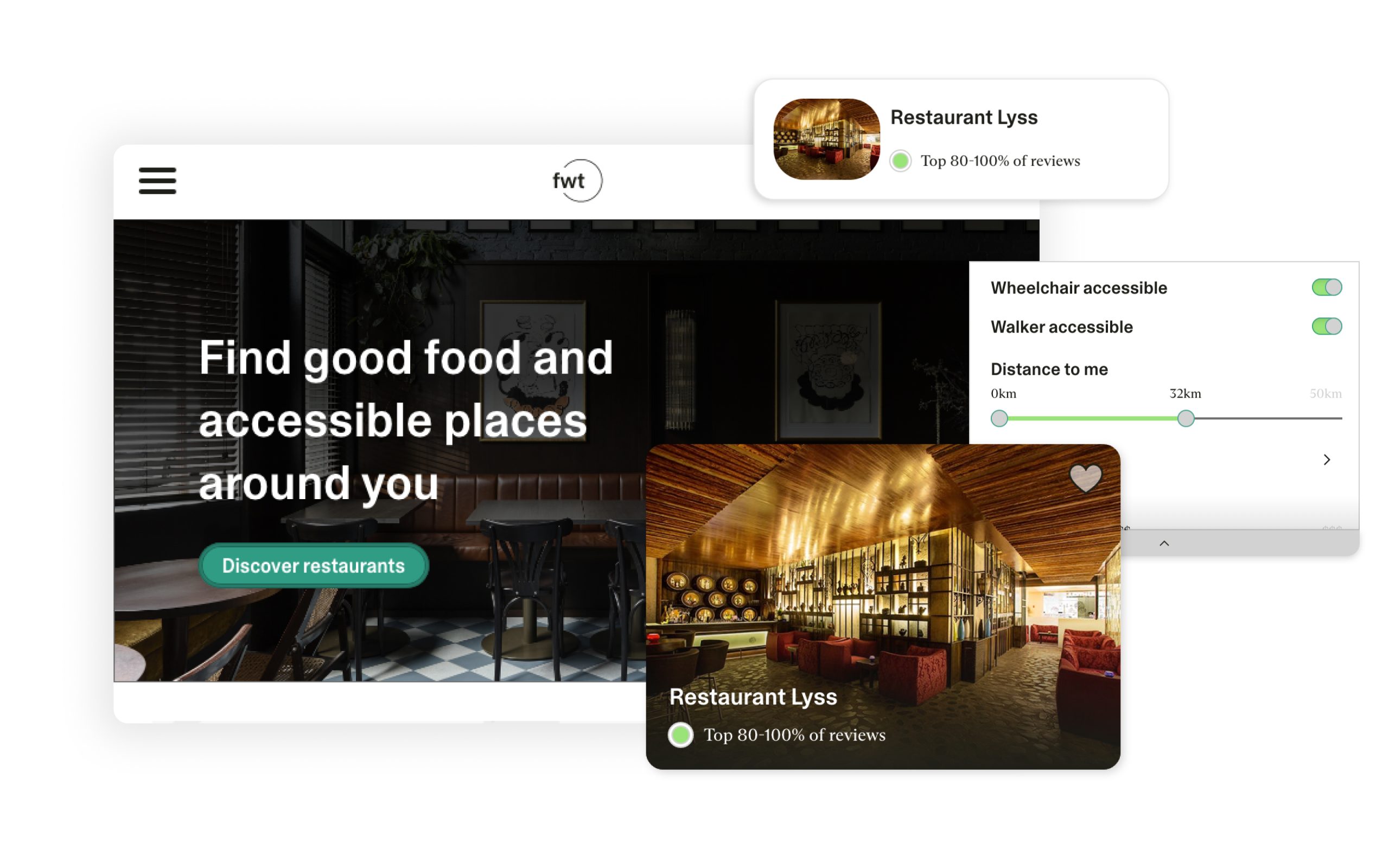
”food with thought” is a mobile app that finds the most accessible restaurant around

Project duration:

Started from August 2022 until January 2023 at 10%

The problem:

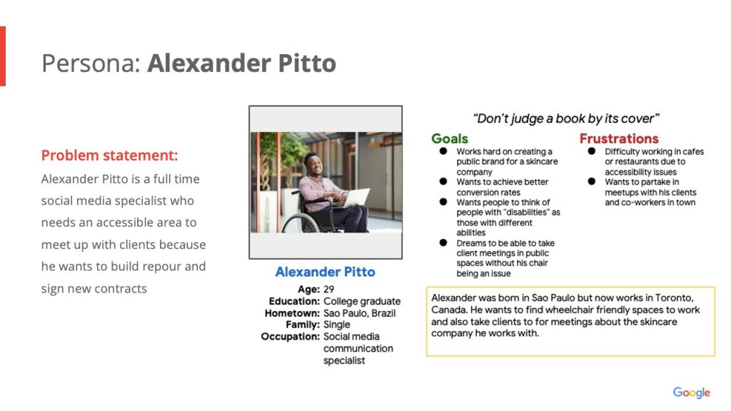
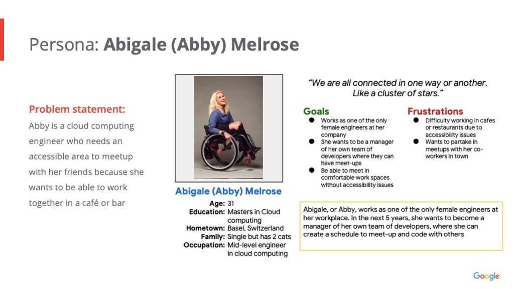
Finding accessible restaurants for people with disabilities

The goal:

To create a user friendly platform that users can use to find accessible restaurants

My role:

Lead UI/UX Designer

Responsibilities:

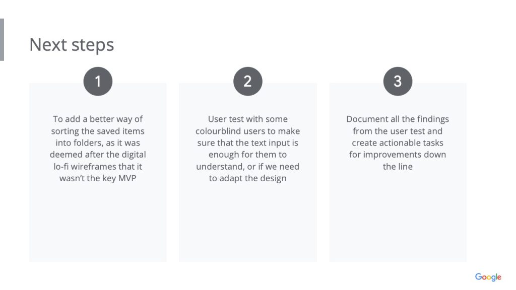
Research (competitor analysis)

Wirefraiming (both lo-fi and hi-fi)

Final delivery of prototype and assets

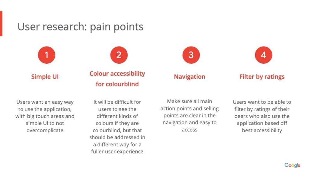
I conducted a few interviews with a few potential users and close friends who gave me feedback on the potential key features that they would use in a restaurant locator app. I also interviewed a few people with disabilities to see how useful it would be for them as well. I discovered that a lot of the users want an easy way to find restaurants around them, or for the future, that has accessible colours, simple UI and overall great user experience in ratings.

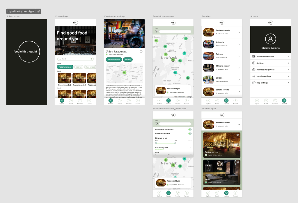
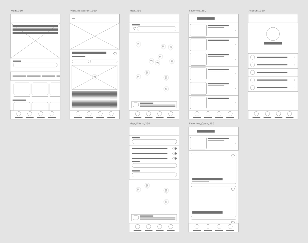
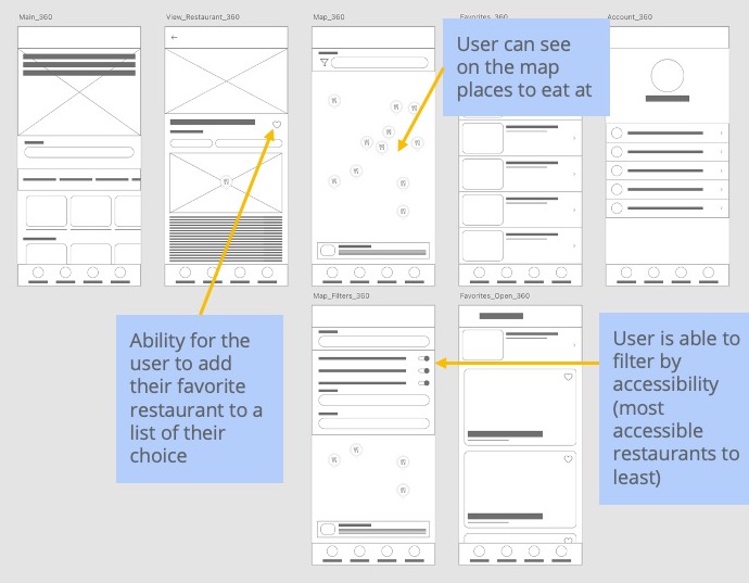
After the initial sketches, there were a few things I didn’t like and re-organized the flow of the application

VIEW HIGH FIDELITY PROTOTYPE

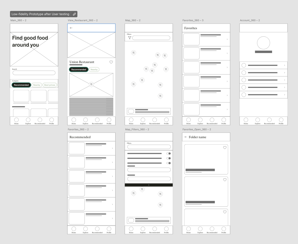
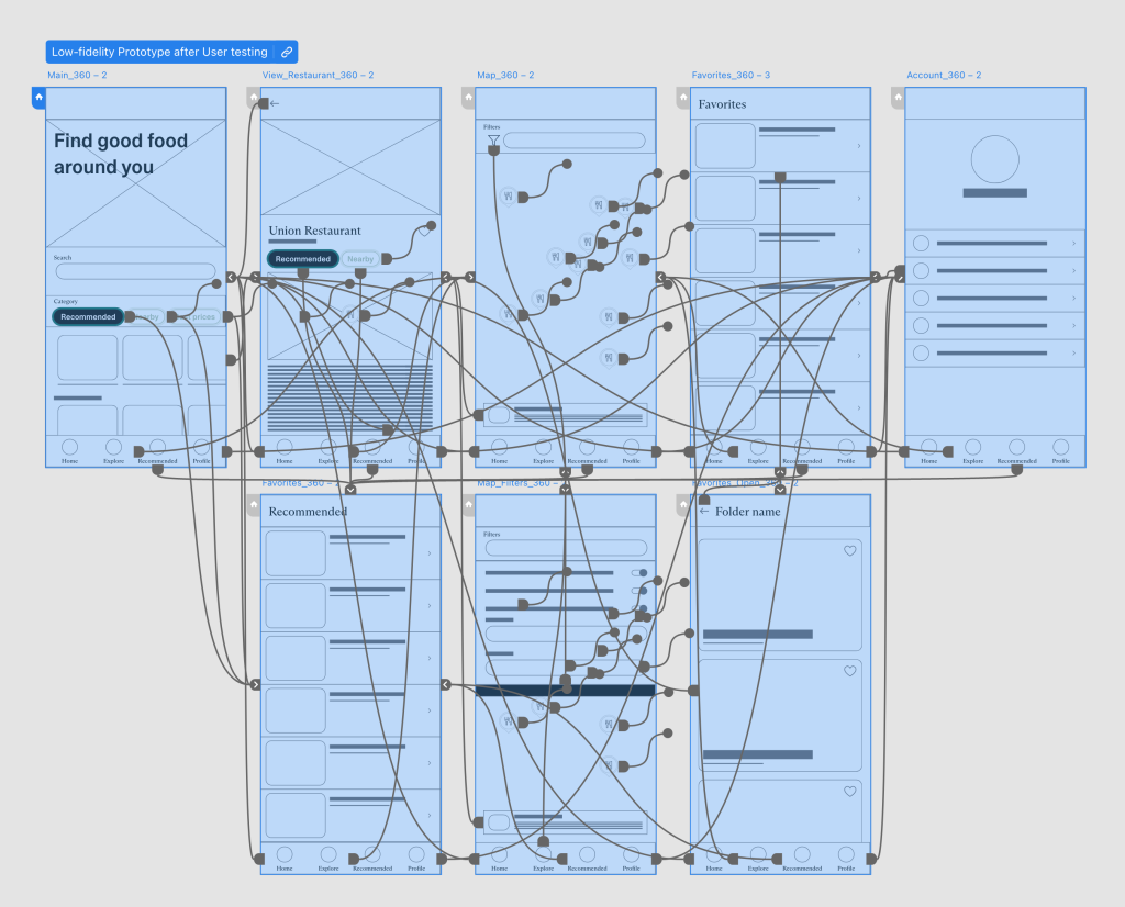
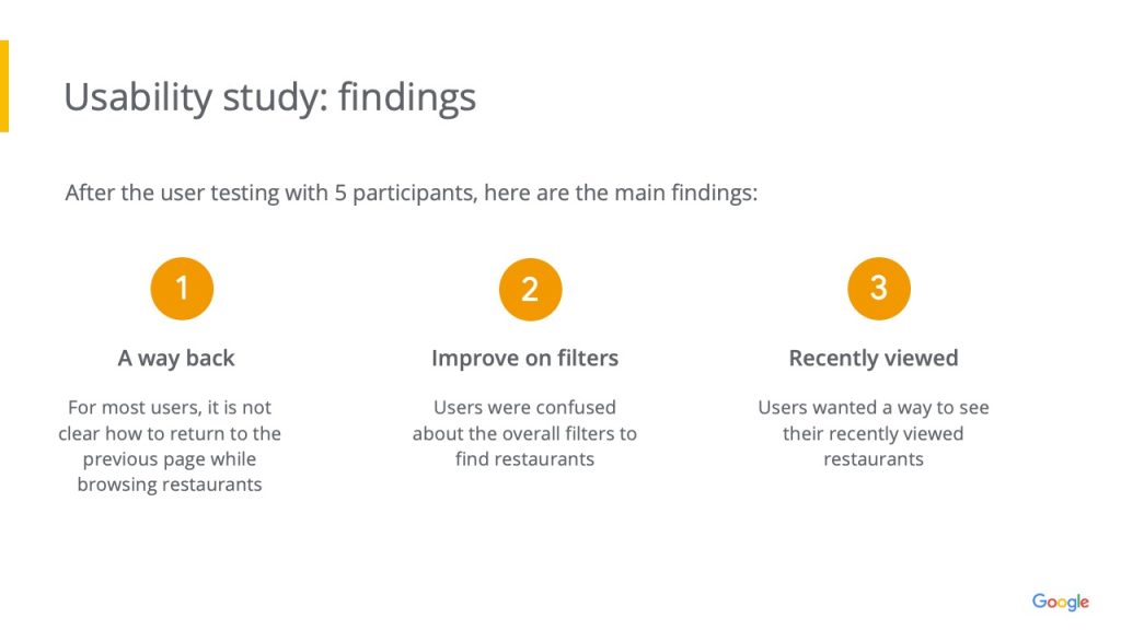
After listening to the users feedback, I had added better CTAs and simpler flow with the bottom anchored menu

Impact:

When designing, if you first put the end user in mind some of the problems will just solve itself. If we also keep designing for accessibility in mind, then we will also create solutions not just for one but for many.

What I learned:

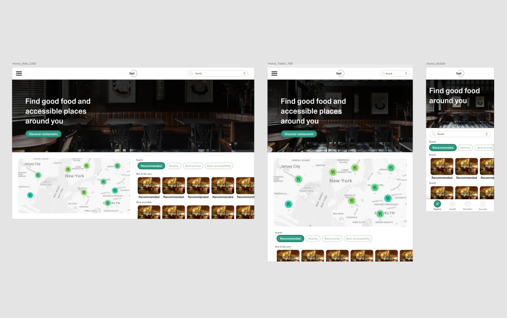
What I learned is that many of the components in a website might have a different way of scaling for different screens and to make sure that the original component and icons are designed for that flexibility